Script Writing Lesson 1: Compacting FileMaker Scripts – Making Your Code More Readable By Humans

We could discuss at length what we should and what we should not do while writing a FileMaker script. If you’re an expert you have your own opinion on this, if you’re a newbie, you can be overwhelmed with all the opinions the experts have. Not to fear, I’m not here to argue points or overwhelm the newbies (which I was at some point and I did find a lot of things overwhelming). This post is simply there to remind you of some best practices in script writing and help you get your scripts:

  1. a little more compact
  2. more readable and
  3. easier to debug (if you have FileMaker Pro Advanced, you can use the debugger and data viewer to see what your script does).

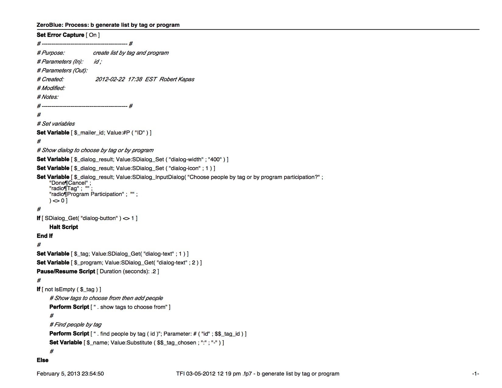
The script below uses functions from the 24U SimpleDialog Plug-in, which I use often to produce dialogs, because it extends dialog capabilities in FileMaker beyond the basics. First and foremost, pay attention to the first couple of lines. For your own, but especially for other developer’s sake, use some space at the top to introduce your script and let people know who wrote it and when. If you make significant cahnges later, it might help to fill out the “modified by” section, as well. I capture the errors, so in case I need to do some error logging, I can do that. I perhaps will talk in anther post about error logging. Every section in the script has a note on it, so I can tell later what exactly each section is for. This is not a crazy long script. I’ve seen scripts that took literally so long to debug that I forgot what it did by the time I got to the end. BAD, BAD, BAD. Ok, so I’ll let you read through the script and see you when you’re done.  (It’s only 4 pages; hopefully it won’t take you too long.)

So, what do you think? My brother and I threw this script together for one of our clients. The goal was to be able to guide users to generate a list based on certain criteria and then let then choose an output method, then generate a file. Simple, right? I don’t believe the above is a bad script. Not because I’m bias, but rather because I’ve written and seen long scripts. A long script is also not necessarily a bad script. A bad script is one that doesn’t function well or leaves room for error. A long script is just hard to read, decode and hard to debug. Imagine a 1000-line script where you just want to test something on line 900. You’d have to either ignore the first 899 lines and put a marker in (in which case you don’t know if things are happening as they supposed to be.)

Agnes Riley Won The “Mad Dog” Award 2 Years In A Row

Miami, FL July 18, 2012

FileMaker Public Relations awarded one of this year’s Mad Dog Awards to Agnes Riley of ZeroBlue at the FileMaker Developers Conference in 2012. This is the second Mad Dog Award for Agnes Riley two years in a row. The winners, representing the U.S., Europe, and Australia were acknowledged for their contributions in promoting awareness of the FileMaker name in the media and social media.

Agnes Riley has been at the forefront of communicating FileMaker news, writing blog posts and promoting the FileMaker name. Winning this award again is a recognition by the industry and FileMaker, Inc. of our hard work.

Thank you, Everyone for reading the blog and Facebook posts and tweets.

Robert Kapas Is Now FileMaker 10 Certified

We’re happy to announce that another member of our staff, Robert Kapas is now certified in FileMaker 10. Congratulations, Robi!

Converting Files to FileMaker Pro 12

As you may know by now FileMaker 12 is out. A lot of articles have been written about the various features, so I’m not going to bore you with that. FileMaker 12 for iOS is free, so if you haven’t grabbed a copy, go get it. It comes with some demo files to play with to learn about the new features.

With every new release the question comes up: should I wait or should I convert? I think this question should be answered separately whether you’re a developer or a user. Users tend to jump in a lot faster. I have users who just announced they converted their database. Once it’s done—and you start using the database— it’s hard to go back. Developers I talked to are wary about converting, so we have two different groups with one goal: data integrity, however, their patience levels are different.

FileMaker Pro 12 can directly convert your existing FileMaker Pro 11, 10, 9, 8 and 7 databases.  All other versions of FileMaker Pro will require a multiple product conversion.  Review the information below to determine whether your files will directly convert to FileMaker Pro 12, or if they will need to be converted multiple times.

More info can be found in the FileMaker KnowledgeBase.

So, before jumping in, let’s look at a couple of things.

If You Are A User

First and foremost discuss the conversion process with your developer, if you have one. It’s a new file format, you’ll need to upgrade the server, as well as the file(s). If you don’t have a developer, take a look at your dataset. I heard complaints about issues with scrolling in list view. This may not affect you if you don’t use list view, but it’s worth knowing. I, for one, never use list view in the solutions I develop. I use portals that can be filtered in many ways instead, so you don’t have to work with large sets of data at any given time.

Take a moment to consider how mission-critical your solution is. If you’re a small shop (couple of people) with a one-file solution you may be able to just jump in and bite the bullet. You may never have any issues. And you may love a lot of the new features FileMaker 12 offers including the new layout themes. I’d still make a copy of the new database and run FileMaker 12 parallel to your FileMaker 11 (yes you can) and test the new database for a good couple of days. Run scripts, create records, check the mission-critical processes.

If you’re a larger shop or your database is mission critical, I’d take a copy of the file, convert it, put it in a test environment. Put in on a new server (different machine than your FileMaker 11 server). Test your new database thoroughly for about a week. Test systematically. Test for as many processes you can.

If You Are A Developer

Then it is your duty and responsibility to manage client expectations and not let them commit suicide. The same applies to you as the large shops who have a test environment and can perform lots of tests. But you also need to consider that FieMaker 12 has changes that affect the developer, as well. One example the new layout tools. Test the development features, as well, to make sure you will be comfortable developing on the new version.

We’ve been waiting awhile for FileMaker 12 and we are all excited. I love the new Insert from URL function, for example, but  when I developed a database for the iPad for a client, I noticed that getting XML takes 5 minutes on an iPad2 in FileMaker 12. This is not a concern for my client, I believe, but it can be a concern for more mission-critical environments.

It’s possibly best to convert, while your users are not using the database. A weekend might be a good time if you can’t set up a test environment. But as you know, we have 4 weekends in a month, so don’t schedule more conversions than you can handle.

Talk to us, if you need help converting your FileMaker files or have questions about development.

Trojan On Macs – What To Do

I wish I could write about FileMaker 12 (which I will, soon) but there’s a more eminent issue right now: there’s apparently a new trojan out there attacking our Macs. When I read something like this, I generally just ignore it (because I have not seen a virus, malware or trojan  for Mac OS X), but I have done my research and it seems several large websites picked it up, such as Gizmodo and PC Magazine, so it would be unwise to just ignore it. According to sources, 600,000 Macs have been affected. That’s a large number to ignore. Read below, check and fix if you have it.

No worries, F-Secure has a fix for the problem.

Gizmodo has a method to check your computer; you can find it here.

I ran their check and I’m clean:

new-host-3:~ ariley$ defaults read /Applications/Safari.app/Contents/Info LSEnvironment
2012-04-05 11:39:23.355 defaults[24956:707]
The domain/default pair of (/Applications/Safari.app/Contents/Info, LSEnvironment) does not exist
new-host-3:~ ariley$ defaults read ~/.MacOSX/environment DYLD_INSERT_LIBRARIES
2012-04-05 11:39:41.692 defaults[24958:707]
The domain/default pair of (/Users/ariley/.MacOSX/environment, DYLD_INSERT_LIBRARIES) does not exist

The check is easy; all you have to do is issue two commands in the Terminal. I highly recommend that you do it.

Also, install the Java upgrade Apple just released. Go to Software Update under the black Apple in the upper left corner and check for updates; it will show up.

NJ FileMaker Developer Group Meeting Recap: GoDraw – 03-28-12

Another great session at Essex Computer in Paramus.

We had the pleasure of having Todd Geist from Geist Interactive remotely demoing GoDraw.

Todd always blows me away. He is unbelievably smart with a keen eye to design producing highly, sought-after solutions for FileMaker, such as telephony integration or GoSign to name a couple.

The brand new solution, GoDraw enables users to draw on an image in FileMaker Go. It is amazing and we’ve long waited for such a solution.

The use cases are endless:

  • Emergency response: Take pictures at a crash site. Now you can mark them up.
  • Delivery service: broken package can be marked with exact damage location.
  • Architects: take a photo at a site. Add your own doodle to show what the building would look like with another floor.

mazing and we’ve long waited for such a solution.

You can draw on a plain canvas of different colors or use an image (from camera or gallery) and draw on it with different colors and stroke sizes. You can even switch modes to erase part of your drawing. Once you save it, it will be accessible from FileMaker Pro on a desktop. You just can’t modify it from the desktop and re-save it. You can however, always make changes from FileMaker Go at a later time. The image and the doodle are saved as separate layers.

We saw how easy it is to integrate GoDraw into your own solution. It took Todd about 10 minutes to do it live. All you need to do is import some assets from the starter file (table and data), import a script, place a webviewer on a layout, set up a relationship and hook everything up. You can even dig in deeper to modify the settings, such as change canvas size and colors.

If you need help integrating GoDraw in your solution, we’re here to help, contact us.

The Lite version is free. 5-user license at $149, site license $249. It’s really affordable.

Tip:

We learned from Todd yesterday that you can import a whole table from one FileMaker database to another:

Todd will be giving two great sessions at the upcoming FileMaker Developer Conference: one about writing portable code (one of my favorite topics) and another one about useful techniques such as using unique IDs, how to give users access to their own data only, etc.

Differences Between FileMaker And Excel

Everyone I know is familiar with Microsoft Excel to some extent. Some people are more well-versed than others and can do complex data management. Not long ago I met with a consulting company who is working with one of the largest companies in the country to install hardware nation-wide.

The original process is so cumbersome that they now have a lot of things fall through the crack. By the time an order goes through the myriads of departments and processes, the requirements change and the parts required, as well. But the warehouse doesn’t know how to handle that. So they called in a consultant to help. The consultant doesn’t know FileMaker, so they created a giant web of Excel sheets that actually do a really nice job at filling in the gaps and getting the orders straightened out. FileMaker could’ve given them reports and live dashboard so they can see which orders have mismatched elements or which orders need to be fulfilled in the near future. But at this point they invested quite a lot in Excel, so I doubt they will have the time and energy to redo it in FileMaker.

To those who have not put too much effort into Excel or finding it cumbersome to manage their day-to-day activities, the below will give some incentives to use FileMaker instead of Excel to manage contacts, products, inventory, documents, and events. Contact us if you need help deciding. Learn more about FileMaker development.

Strengths of a spreadsheet

  • Storing and analyzing data in lists
  • Analyzing and modeling data
  • Producing charts and graphs
  • Building a financial model
  • Creating basic reports
  • Controlling who can open or modify a file

Strengths of a FileMaker database

  • Viewing information in list, form, or table view
  • Storing and managing virtually any type of information (words, images, numbers, files and more)
  • Creating and publishing customized forms and reports
  • Connecting related information such as inventory and sales
  • Connecting to and from websites
  • Access by multiple people at the same time
  • Mobile access through FileMaker Go or web
  • Set up recurring imports from Excel

Tip:

Use FileMaker to normalize data headers in Excel. This past weekend I was working on my new web store (ssh!) and I had to export/import products. When importing into the new system I encountered an error: “data headers are duplicated”. Well, I looked through the header row in Excel and I couldn’t see anything duplicated, but when you have a lot of columns you shouldn’t rely on your eyes. I did a quick web search and I couldn’t find an easy method to figure this out. Then I realized, why not use FileMaker? So, I quickly converted my Excel sheet to a FileMaker database (drag and drop) and I had all the fields and data in FileMaker. Clearly, FileMaker didn’t have an issue with the fields, so there was no duplication; the web app lied. So, even though I was back to square one, I figured the web app might not like the file format of the CSV file I was trying to import. So I converted it to another format (Windows of all things) and the import went through just fine. Moral of the story: I could’ve spent more time trying to figure out  how to get rid of the non-existent duplicated headers in Excel. But instead, I called FileMaker to the rescue, and it solved my problem in 2 seconds.


UI Design – 10 Tips For Excellent UI Design (And Not Just for FileMaker!)

We can all agree on one thing: Apple knows design. The reason why Apple’s design is excellent is because it’s minimalistic and draws the users’ eyes to what needs to be seen and hides the rest.

A perfect example is the aluminum keyboard:

  • size: as small as physically possible for average fingers to type on;
  • key height: as shallow as possible for a good rebound effect;
  • the USB ports are hidden under the keyboard.

Follow the Universe. The stop sign is a universal symbol. Can you imagine if NYC decided to swap them out in hot pink and the shape of a triangle? You’d have cars piled up at every intersection. Of course, in a database we cannot cause traffic accidents, yet still it is important to pay attention to some design principles.

Quality itself is not enough. Some cultures have always paid attention to design and some took awhile to catch up. I remember how I hated the the style of the former Soviet Union while growing up in socialist Hungary. Every product that entered our country from them was large, boxy and durable, but hard on the eyes and hands. On the other hand, leave it to the Danish or the Swedes and you are guaranteed your product will be carefully designed.

“Even though design is not the most important thing, at the end of the day we are looking at this thing all day long,” said a possible client to me about their current design.

A good designer always looks at the interface from the user’s standpoint, not their own. It is always easier to slap on two more buttons, pick a color quickly and be done. But will those buttons fit in your theme? Do you have a theme at all? Web development has changed drastically over the last decade. Barely anyone uses Flash anymore, and people realized that you don’t need to have every color on the horizon on one screen. FileMaker shouldn’t be any different. A database, actually, gets a lot more screen time than any website, so it really should be paid attention to.

I just was faced with the UI below and even though I’m a designer/developer, I couldn’t figure out how to use this service. My initial thought was I must be stupid and/or getting old. Then it hit me that this experience is not my fault. A good interface is about not having to write a lengthy manual just to find the start button.

I’d like to give some pointers to new and old developers alike on some key details to pay attention to. Your users will thank you for it.

Design your theme

Don’t just start plunking elements on a layout. Or even if you had to do that last week (because your boss put a gun against your head and said you will have to put 23 more buttons there), take some time this week and visualize your user interface. Think about why the user needs to be there in the first place and what they need to see. Resourcehttps://kuler.adobe.com or https://filemakerthemes.com. Kuler even has an option to upload your image (client logo, brochure) and build your color theme from it.

Design for the appropriate screen size/resolution

Ask your client: what screen sizes/resolutions do you have? Are you on Mac or Windows or both? If you have a mixed screen environment, you have to design for the smallest screen, and extend everything from there. You can always extend white space, but if you start too large, they will have to scroll left and right or up and down to see their data.

Be minimalistic

Show interface controls on demand. If there is something you can hide, hide it. The user can always get to it later. If you overwhelm them, they will feel like a kid lost at Grand Central Station. There are plug-ins you can use for this. Resourcehttps://filemaker-plugins.com.

Minimize travel time

Isn’t it great that we have www.hopstop.com now with so many cities that we can choose routes with fewer transfers? Try to think of a way to get your users from point A to B in the least amount of time. Try to get as much information into one dialog as you can so they can choose what they need and move on.

Don’t abuse color

Choose 2-3 colors that complement each other. When in doubt, it’s always a good idea to use shades. You can never go wrong with black and white and shades of gray or another color.

Draw the users’ eyes to what they need

If you’ve seen heatmaps of web interfaces, you know that most people look from left to right and tend to ignore elements on the right. Try to put the most important elements on the left side. highlight the record they are viewing. Don’t reinvent the wheel, because you’ll just throw your users off and make them frustrated.

Use appropriate font sizes

Some things need to be in large font or bold (names, phone numbers, invoice totals). Make an executive decision and highlight the most important details.

Use appropriate font faces

Helvetica is an excellent font. If you want to go crazy, you can always mix 2-3 fonts, but no more. Verdana was meant for web design, and even for the web we don’t have to use it anymore. Note:  Some fonts render differently on Windows.

Display help and informational messages

Tooltips are built into FileMaker. Use them to give your users more info to minimize travel time. You can be creative with tooltips. You can use a tooltip on a contact to show:

  • more contact info;
  • whether they owe your client any money;
  • the information on their latest orders, etc.

Replace FileMaker notification messages with your own

A nicely worded error message in proper English is that says “Unfortunately, there were no records found. Would you like to do a new search?” is much more welcome than a plain old “No records match this find criteria.” It’s even more important to provide proper feedback in more complex situations so your user always knows why something didn’t happen. Another example: if you export reports to the desktop, name them with what the report is about and give the user a note at the end that the report was indeed created and this is what it’s called. Finding a document called “untitled” is very taxing for busy executives.

Conclusion

When combined with a clear focus on how the user is expected to interact with your product, the above tips and tricks work hand-in-hand to deliver something that’s not only good-looking, but usable. We can look to Apple as a leader in setting the standard for great design, but they’re not the only company that has design and usability as guiding principles for much of what they build. The excerpt below is from Smashing Magazine, and is what I’ll conclude with:

Similarly, the minimalist interface of the Google search engine manages to fully accomplish its objectives without getting in your way. The interface disappears, letting you focus on getting things done.

Steve Jobs once said, “design is not just what it looks like and feels like. Design is how it works.” In fact, the usability and overall usefulness of an app is governed by how well it performs its functions and how easily those functions are accessed. Design with a goal in mind — a goal that the interface helps your users achieve. Not every technique will work in every situation or for every application. Only implement interface elements if they make sense in your particular context. / Smashing Magazine

How To Hire A Consultant

Why would you want to spend time reading this article instead of just hopping on the phone and calling people? Because it can hopefully save you time. And if you are a small business owner—just like I am—you care about your time because it costs you money.

For us to communicate efficiently, I’d like to give you a couple of tips on getting ready for your first phone call with us (or any design and development firm for the matter).

Visit Our Website

Spend some time browsing our website, take a look at our portfolio to learn about previous work, read some blog posts, learn about our feature set.

Build A List of Features

Whether you are starting from scratch, want a new website or want to add some features to your existing database, knowing your feature set is important. No need to go crazy just put together a bullet list of features.

Build A List of Business Problems

Jot down—in the order of priority—the business problems you are trying to solve by getting a new system or making modifications to the old one.

Some examples would be:

  • you cannot access your contact list when you’re on the road;
  • you cannot see your latest sales of the day or how much you sold altogether;
  • you cannot see the profit margin you have;
  • you cannot access your inventory database from the warehouse;
  • you have a lot of Excel sheets and they are not ‘talking’ to each other.
Find Some Examples

It’s beneficial to find some examples of work, navigation or theme you like. Create a sublist with comments  for those (likes and dislikes).

Jot Down Some Questions

Just like at a job interview, goot to be prepared to ask some questions. Some questions might be:

  • “Do you charge for discovery”;
  • “How does the process work”?;
  • “What is your availability”?;
  • “How much involvement does the process require from my company”?;
  • “Any references I can call”?

Then when you do get on the phone you will feel empowered and you can drive the conversation.

We are here to take your business to the next level.


FileMaker Conditional Formatting

When the conditional formatting feature was announced by FileMaker some of us screamed “yeehaw”. No, really. It was a long-awaited feature and right away we knew there are no limits to its usefulness.

If you do not know what conditional formatting is, here’s an excerpt from FileMaker Inc.’s website.

You can set Conditional Formatting for text fields, FileMaker Web Viewer objects, merge fields, text-based buttons or layout symbols (e.g. date, time, page number, etc.). Choose how objects display by modifying fonts, styles, size, text color, and fill color. Pick from a list of 20 pre-defined conditions or create your own with a calculation for enhanced reporting. Conditional Formatting settings affect only the way data is displayed or printed and not how data is stored in the database.

So, in other words, you can basically emphasize or hide data on a layout with conditional formatting.

I would like to share a handful of examples with you, some of which you may know and use (and have seen on other blogs), but the goal here is simply to put some ideas on one page and spark more ideas. A lot of times my inspiration comes from looking at something that was not intended for its current use.

The Problem

We all had users call us and say “I’ve been entering records and now they’re all gone”.

The Solution

Place text “You are in FIND MODE” in the same color as your background. Formula: Get ( WindowMode ); set the color to bright orange or red. Get ( WindowMode ) window modes: 0 for Browse mode 1 for Find mode 2 for Preview mode 3 if printing is in progress.

The Problem

User cannot easily identify which field they clicked in.

The Solution

Simply use “1” as a formula (assign the color white to it). I normally set the field to a light yellow fill color on the layout.

The Problem

A selected portal row needs to be visually differentiated from the other portal rows.

The Solution

Place a text object over your fields. Make sure it matches the edges of the row by pixel, then send it backward until all of your fields are in the front. Apply conditional formatting to it so when that row is selected your objects gets a darker fill color color (however your row is selected depends on your database rules). Now do the same for your text fields, making sure your text gets white (or contrasting light color) when the same condition applies.

The Problem

Information in a field needs to be highlighted based on action. In the example below paid invoces get a green color.

The Solution

Apply conditional formatting to a field or a set of fields. The condition in my case is Paid = 1, then assign color green to my field.

The Problem

Users need to be reminded to fill out certain fields on a layout.

The Solution

When the field is empty [IsEmpty (field)] set the fill color to red and the text white (again, contrasting colors). Also, make the text size 500 points. You could make it 1, too, but then you’s see a spec of white, and that’s not pretty.

The Problem

A field has data with variable length. You, however, don’t have the space to make the field very long. In my example, my field width is 138 pixels and my font is Helvetica, 13pts.

The Solution

Apply conditional formatting formula to the text size in the following manner:

 Length ( Self ) > 20 (Set text to 12pt) Length ( Self ) > 23 (Set text to 11 points) 

Depending on your real estate on the layout you’ll need to choose the appropriate length and font size.

This has hopefully wet your appetite to use conditional formatting if you havent yet. Feel free to share examples of your own.